Fixing First Impressions
Redesigned onboarding that boosted conversions by 61% — by cutting user confusion and getting straight to the point

problem realm
MyBluebird, a ride-hailing platform, was underperforming. Despite high acquisition rates, only ~33% of users were successfully registering. Confusing entry points, redundant input steps, and unclear error messages led to high drop-off rates.
Solution realm
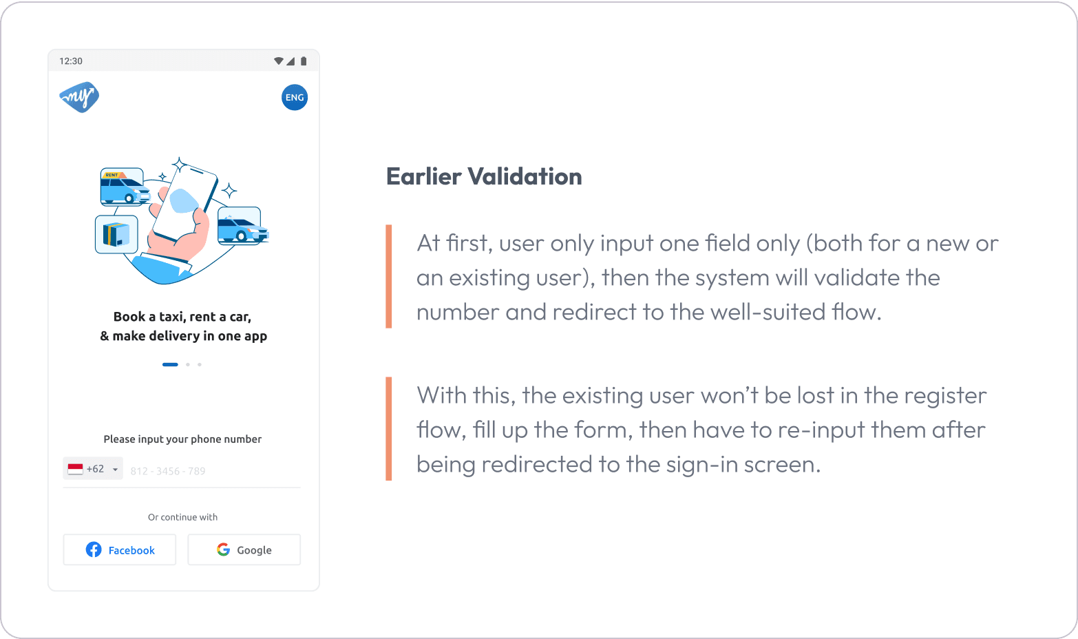
The onboarding flow was redesigned by the product design team to automatically detect new versus existing users via phone number, remove redundant screens, clarify error handling, and validate changes through A/B testing.
outcome
The registration success rate increased from 44% to 71%, login success rose from 54% to 69%, and registration time decreased.
Inside the Process
Background: What Internal Signals Revealed
Prior to the redesign, internal product analytics flagged a troubling insight: the onboarding flow was leaking users at the earliest possible stage. Although acquisition numbers were healthy, only a third of users completed the registration process.

Registration success rate within the last 9 months on the MyBluebird App
Role Scope: Product Designer & Experiment Collaborator
In this project, I led the design ideation and validation activities:
Interpreted internal analytics and drop-off patterns.
Designed experiment hypotheses and A/B flow alternatives.
Created mid-to-hi-fi screens for validation.
Collaborated with PM and engineers to continuously implement and iterate.
PROCESS OVERVIEW
Phase 1: Identify & Observe
Mapped the whole onboarding funnel with metrics to review the drop-off patterns: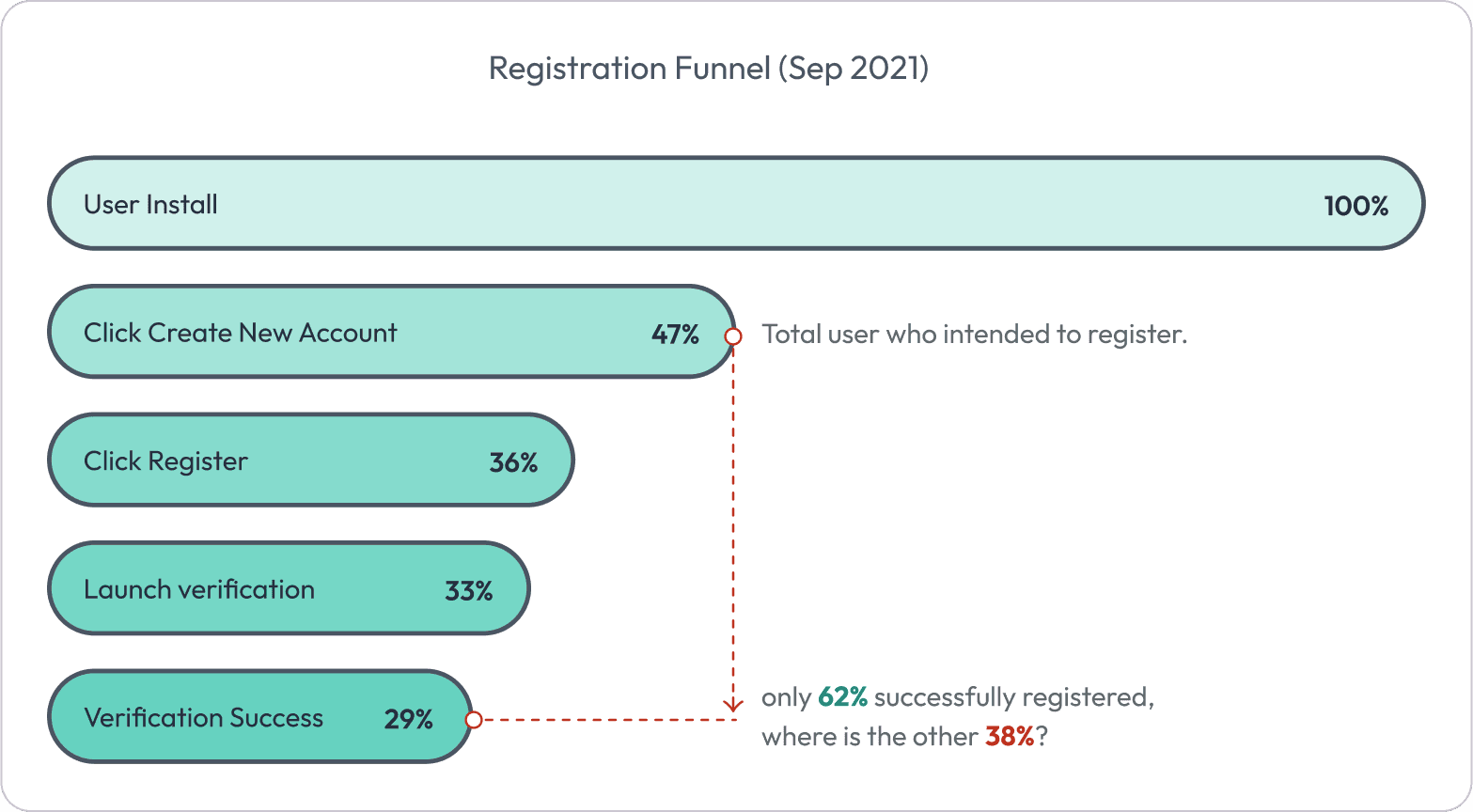
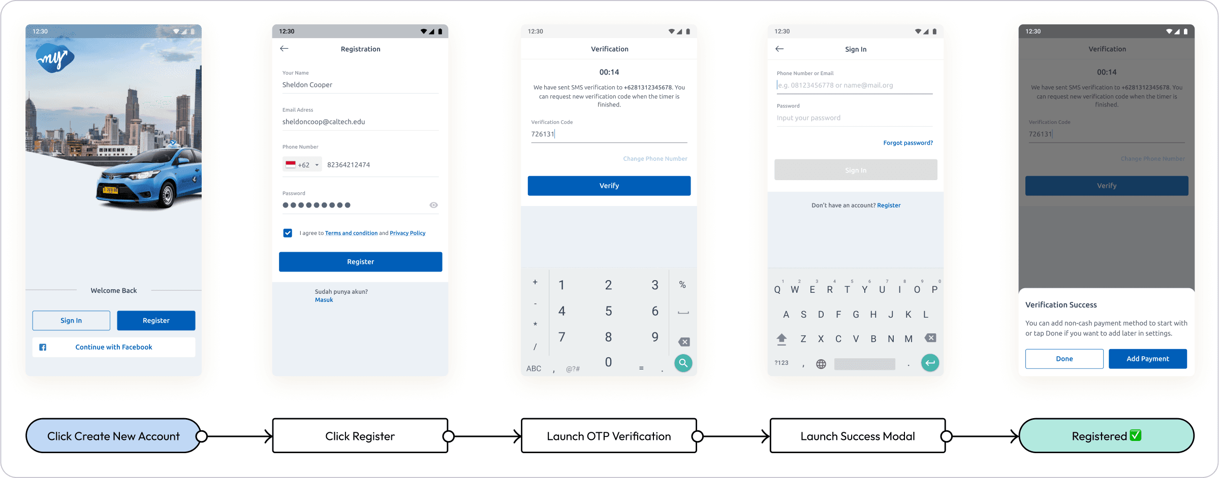
Old Registration Flow
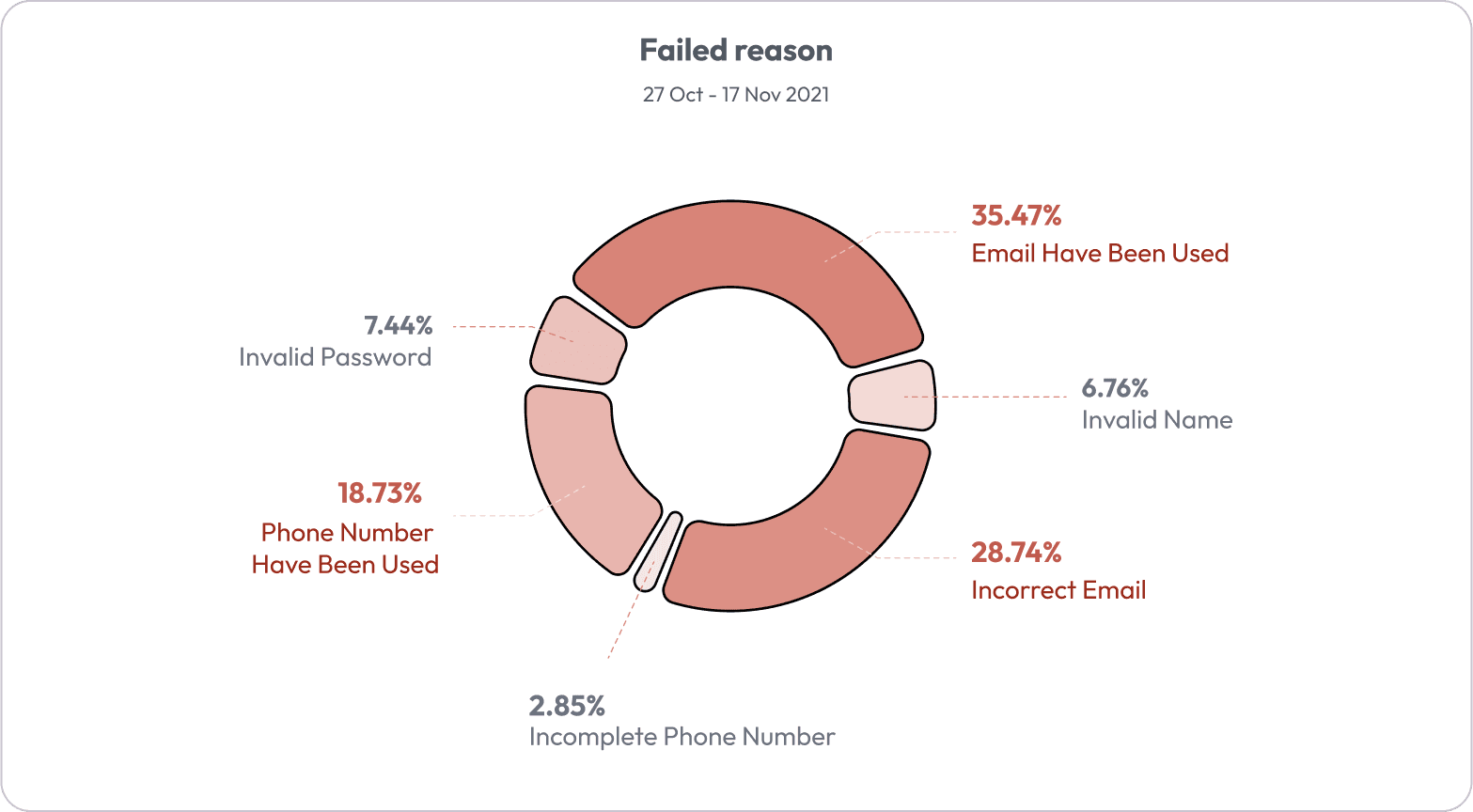
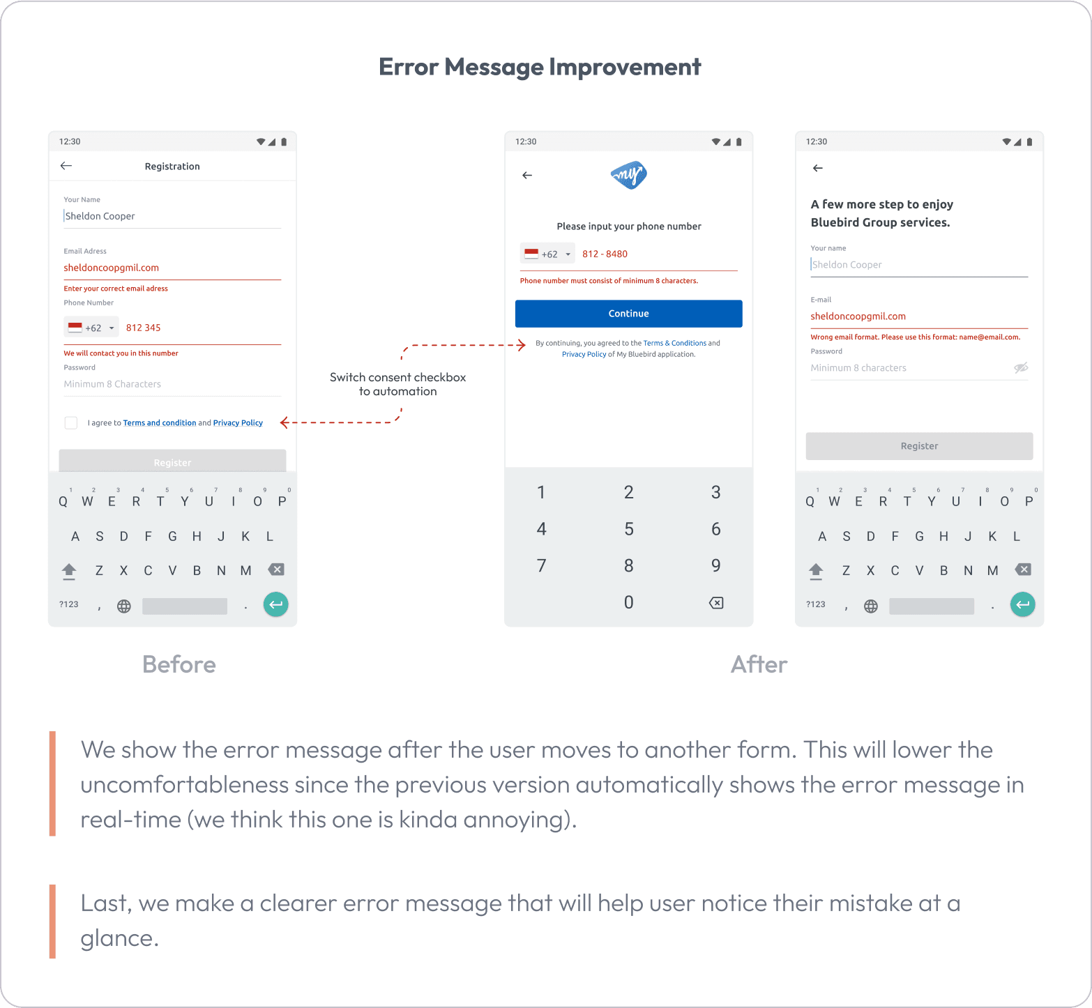
More than one-third of the total users who intend to register as new users didn’t realize that they already have a MyBluebird Account. It is observed that Email and Phone number forms are the primary reasons for registration failure.
Phase 2: Ideation & Design
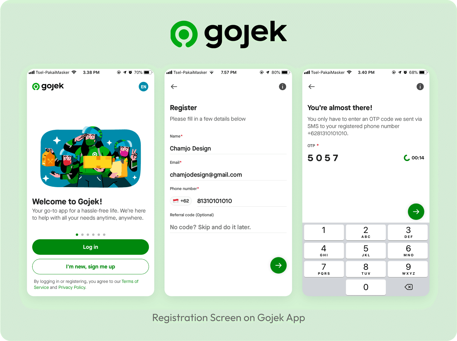
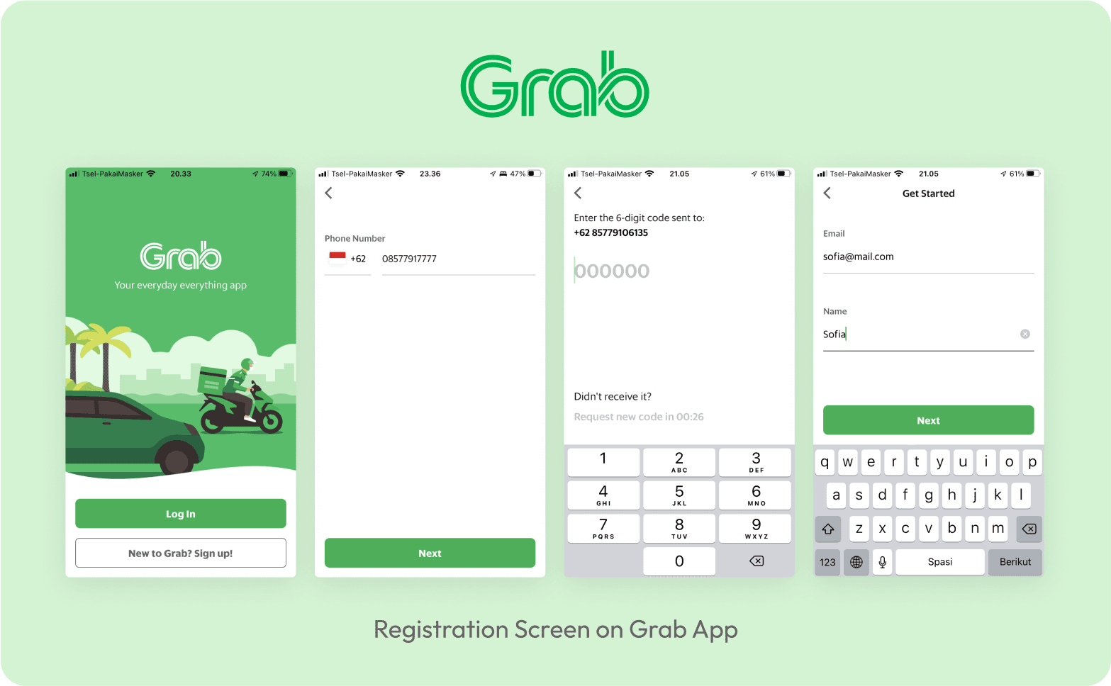
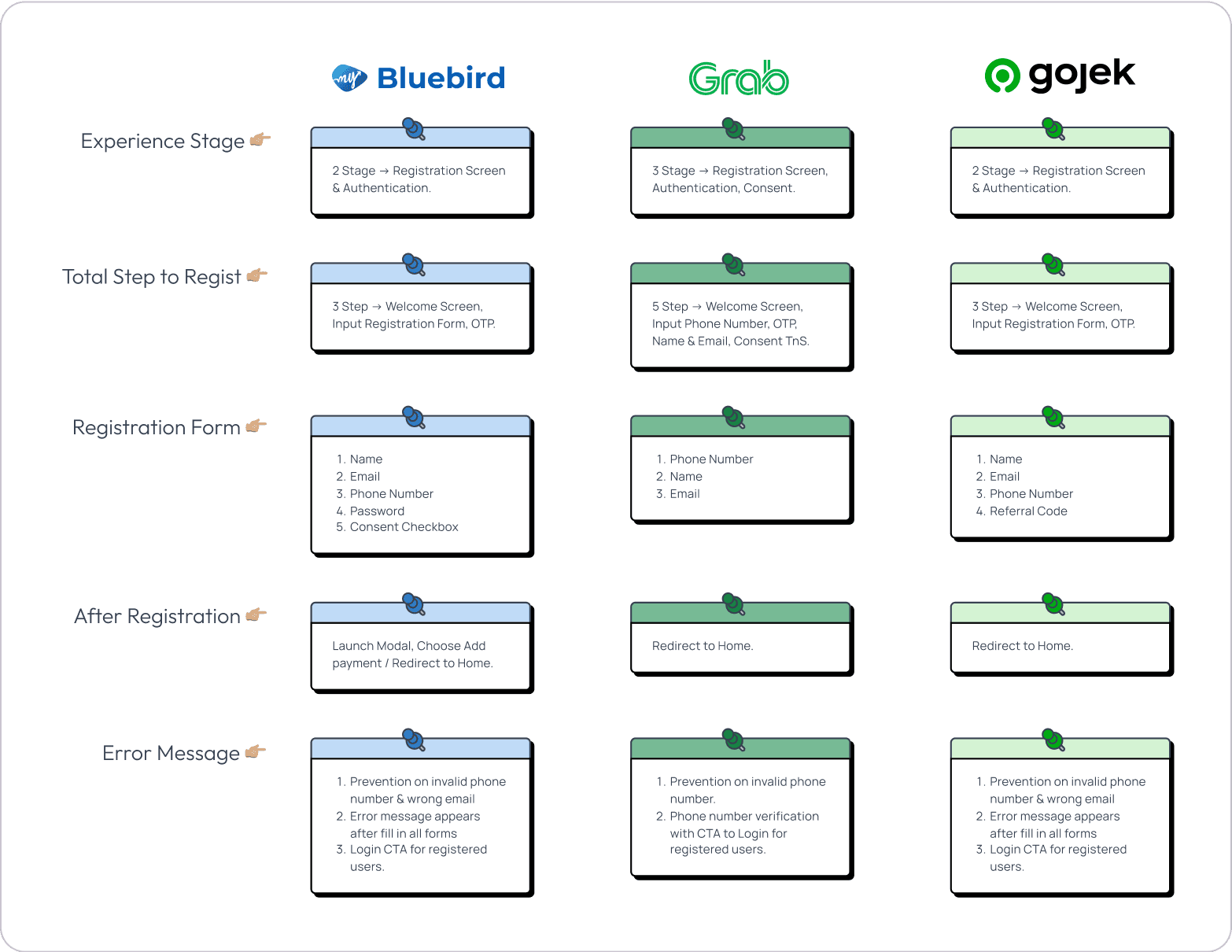
Benchmarked against regional competitors (Gojek, Grab).
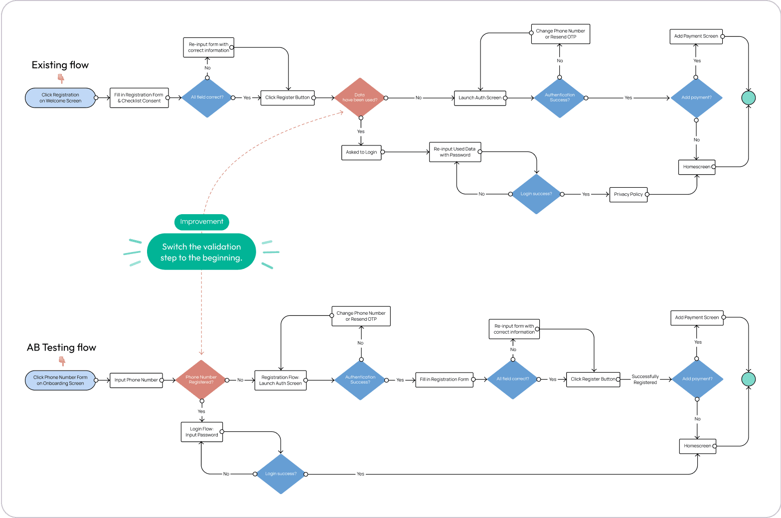
Hypothesized that combining entry flows and deferring error states would reduce friction.
If we simplify registration flow by minimizing the user's cognitive load where the user doesn't need to choose between login and sign in, then we'll see an improvement in the registration success metric because users will find it easier to finish their job (login/sign in).
The hypothesis can be illustrated as the following flowchart:
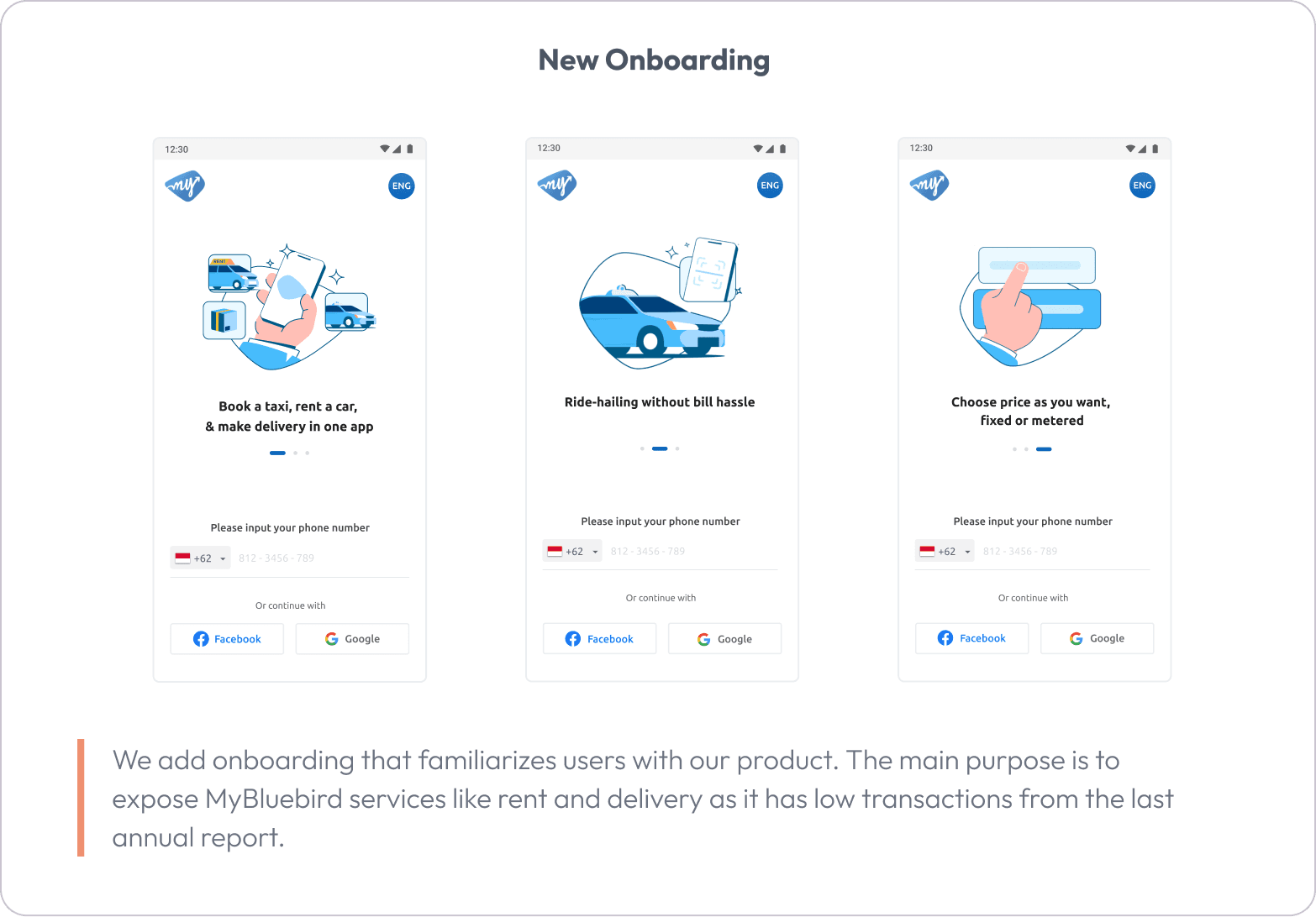
Designed an updated experience:
Phase 3: A/B Testing & Validation
Implemented both old and new flows in a 50/50 live split.
Measured registration success, login success, and task time.

Results:
After conducting A/B testing for approximately one month, where both variants are presented to 50% of the acquired users, Variant B emerges as the winner. Check the comparison below:
Metric | Variant A (Old UI) | Variant B (New UI) | Change |
|---|---|---|---|
Registration Success | 44% | 71% | +27 pts |
Login Success | 54% | 69% | +15 pts |
Avg Time | 2.72 min | 1.88 min | ↓ 69% faster |
📈 Funnel Improvements: Higher completion across all funnel points (register, OTP, success modal).
Registration Funnel | Variant A (Old Version) | Variant B (New Version) | Change |
|---|---|---|---|
| 100% | 100% | N/A |
| 67% | 91% | +17 pts |
| 55% | 74% | +19 pts |
| 44% | 71% | +27 pts |
📘 Lessons Learned
Deferring decisions to the system reduces user cognitive load.
Seamless entry matters more than polished visuals.
Incremental design changes can lead to significant behavioral shifts.
A/B testing clarified the ROI of simple tweaks.
🎯 Opportunities for Iteration
Introduce automatic login after successful OTP.
Autofill user info using social data or past input patterns.